Why Usability Testing is Vital to Success

Usability is something that’s at the forefront of most designers’ minds, whether they’re front or back-end developers. It’s also something that should be considered by content creators, SEO professionals, marketers and anyone that’s involved in a design project.
I’ve talked before about taking a ‘mobile first’ approach and this is to some extent due to the issues that can emerge when designing a site with desktop in mind. If it’s then later discovered that a desktop-targeted site performs terribly on mobile and tablets, then it could mean scrapping the design and starting from scratch. This does of course cost in terms of time and money; the modern consumer demands a great experience across device and that means that the site/app has to perform in a variety of ways.

What is Usability?

An obvious question perhaps. But a necessary one nonetheless, as there is so much talk surrounding the User Experience (UX) and User Interface (UI) at the moment that it all becomes a little difficult to separate.
There is actually no need to separate them. Good design should incorporate all of the above and this will provide a site that, provided content is delivered well too, is highly usable.
According to the Handbook of Usability Testing: How to Plan, Design, and Conduct Effective Tests by Jeffrey Rubin and Dana Chisnell:
“[W]hat makes something useable is the absence of frustration in using it” and further, “when a product or service is truly usable, the user can do what he or she wants to do the way that he or she expects to be able to do it, without hindrance, hesitation or questions”.

Why Carry Out Usability Testing?

While it’s common sense to have first planned out a strategy and know your target audience, there is never any guarantee that a design will be received to great acclaim in the first instance.
This means that a testing period is necessary to ensure that at launch day, you have a fully functioning product that you already know your target audience will love. Yes, you may have tested it yourself, and on a variety of devices, but then you could be a teeny bit biased, so you need feedback from other, less biased sources and these should be potential end-users.
As Steve Krug puts it, usability is really, when you get down to it, the end-user saying “don’t make me think”.
So it’s vital that testing is carried out in order to ensure that the content and layout of the site appeal to the visitor and is actionable, so that they don’t have to think about the next step, just click on a button that takes them where they want to go.

Planning the Strategy

There are several approaches you can take to usability testing and these include three broad categories:
  1. Explorative
  2. Assessment
  3. Comparative
Number one is used in the early stages of design so that the basic framework can be accessed in order to establish if it fits with the target audience and their expectations. The second category takes place during the design process and again, concentrates on the underlying technology of the site, rather than content.
By this, I mean clickable areas, navigation and overall site architecture. At this point it’s useful to test performance too, although this will need to be tested again once the content is put into place.
Thirdly, this is a means of using more than one version of the basic site and testing it on potential users to see which performs best in their eyes, which is of course the goal at the end of the day.
Whilst I say that these are ‘categories’ of usability, that’s not to say you should choose one and ignore the rest. Usability testing should be ongoing throughout the design process, from the stages of planning, the initial prototype and when the site is launched. Even then, it’s something that should be monitored frequently, especially in the first instance.

Getting Started with Usability Testing

Firstly, decide who you are going to carry out testing on. Stakeholders? Potential users through a Beta-testing operation? Other designers? Usability experts even, such as the above-mentioned Mr. Krug?
In the first instance, let’s think about the actual aesthetics of the site, alongside ease of navigation.

Paper Prototype

This is a type of testing that can be very useful in the planning stages, as it requires no real expenditure, yet can give a good idea of how the site should be designed by garnering user feedback from initial, sketched designs.
According to Jakob Nielsen: “Elaborate usability tests are a waste of resources. The best results come from testing no more than 5 users and running as many small tests as you can afford.”
This, he believes, is due to the ‘overlap’ in what all testers will find usable and so based upon his mathematical equation, more than 5 users is a fundamental waste of time. Better to test every element on those 5, rather than use a huge pool of testers that will all say much the same thing, with a few variations on how they say it.
That is certainly worth bearing in mind and illustrates that a huge budget is not necessarily the answer. However, do attempt to find testers that don’t have skewed perspectives due to being family members/friends and so on.
Getting back to paper testing, this allows you to show initial site layout and design at scale, without putting in a huge amount of work in the first instance. Once you have presented the sketches and given users the opportunity to tell you their initial thoughts, you can alter design appropriately.
Think:
  • Clickable areas
  • Content layout & delivery
  • Navigation
Paper prototypes should be created for a variety of screen sizes and this will also allow you to think about content and layout in the early stages and how these will work going forward.

A/B Testing

This allows you to present two different (but similar) mock-ups to see what the user finds actionable, which language tends to draw them in, colors and branding and how this affects the choices a user makes when looking at the designs.
The idea with A/B Testing is that the tester doesn’t get to see both designs, or the results could prove useless, as they are naturally then biased towards one or the other.
A/B testing can be followed up with a survey (as can paper testing), asking the user what they liked and disliked about the design, with questions that are intended to show, rather than tell, you what works well and what doesn’t with each prototype.
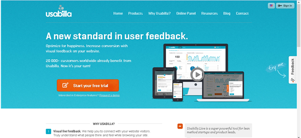
There are tools on the market that can help you with usability testing, such as usabilla and given the increasing interest in usability I’m sure that these are far from the only solution.
usabilla

The USEFul Framework

This is still a conceptual framework which allows for extensive usability testing using a specially designed framework which will be web-based, although it’s still in prototype stage right now. The concept has been published in the International Journal of Human Computer Interaction and is the brainchild of Alexiei Dingli & Justin Mifsud. The framework is intended to address usability and automatically identify when usability issues are violating standard guidelines.
useful
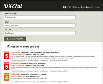
While it is still in prototype, it’s something to look out for in the future as according to its creators: “The USEFul framework was able to correctly identify 91.48% of the guideline-related usability violations when compared to Nielsen and Tahir’s manual evaluation. It is also significant to state that a code inspection demonstrated that 8.52% discrepancy was mainly due to the poor coding of the tested web sites.”

Further Methods and Ongoing Testing

There are a few schools of thought when it comes to usability testing, many of them totally valid and worth carrying out individually at different stages. As Nielsen points out, if his calculations are to be relied upon, it needn’t involve a huge budget and amount of people.
The key is in knowing who is going to be using the site and this is something that the marketing representative of the client should have already arrived upon. This means that for the designer, it’s necessary in the planning stage to know the buyer persona in order to properly address them in the design, layout and architecture.

Preference Testing

This is another type of testing where you are putting two similar mock-ups in front of the test subject and asking them to make a choice. This is quite strongly based in psychology and the way in which people react emotionally to color and language.
This is where it’s vital to know the target audience, as different languages and colors apply to different demographics.

The Importance of Continuous Testing

Usability tests don’t end with the official launch of a website and designers have known this for a long time. Webmasters have a long tradition of using reporting contact forms for issues that occur on sites such as broken links, for example.
However, these days, it’s not enough to just ask users to do this, it’s also important that new information is gathered as the site begins to take hold after launch.
Indeed, Steve Krug advises that testing should be carried out once a month in order to allow new information to be gathered and any potential issues to be resolved quickly.
Certainly these days it’s not a good idea to rest on your laurels, a good site is always going to be an ongoing project, so long as the client understands the need for maintenance and testing.

What it Means to Web and Business

We’re all concerned with making the web a useful and interesting place that gives the user the best possible experience. However, we also have to bear in mind the commercial perspective of the client and so it’s important to realize that usability testing is going to give good ROI.
A well thought out site that’s simple to use, appealing to the audience and accessible is one that is going to be visited more frequently than its poorer, less well tested neighbor. And that, at the end of the day, will result in more conversions.

The Path to Better Vi Skills

Among software developers there is no single subject that will generate more opinions, controversy or discussion than that of “Favorite Code Editor”. It seems we all have a definitive preference and will agrue vehemently in favor of that choice.
At the same time, there is no *nix system to which you can connect today that does not include a version of Vi. It is the single most ubiquitous editor on the planet!
Each of us has, in varying degrees, some mastery of Vi. The command set seems to be larger than any other single application. Most of the commands are very arcane, peculiar and – as a result – difficult to remember.
The various cheatsheets available on the Internet are handy as a reference, but seriously lacking as a directed tutorial guide.
In a deliberate effort to increase my Code Editing Kata, I spent several weeks explicitly using Vi on a regular basis.
And I want to INTRODUCE TO THE WORLD my own set of mnemonics that lessen the steep learning curve associated (real or perceived) with Vi.

A bit of history

Vi (for ‘Visual’) traces its ancetry all the way back to the origin of Unix (in AT&T). As a ‘screen’ oriented version of the editor(s) used with teletype machines, it represented a step into modern computing. The name ‘vi’ is derived from the commmand that switches the line editor, ‘ex’ (Bill Joy’s editor, released as part of the first BSD Unix release in March of 1978), to visual mode.
Bram Moolenaar released VIM publicly around 1991, although he had begun writing it for his Amiga in the late 1980s. It was originally called VI iMitation and, later, VI iMproved.
For the sake of commonality, the following set of tutorial steps will assume you have very, very little experience with Vi. I would venture to say, though, regardless of your experience there is alwayssomething new to learn in this feature-rich software application.
Additionally, everything here is based on my personal experience. The terminology and descriptions are my own and I take full responsibility for them.

Modes of Operation

I have observed several clearly distinct operational ‘modes’ when working with Vi.
  • Command Mode
  • Edit Mode
  • Window Mode
Switching between these modes usually requires pressing ESC.
An alternative to ESC is Ctrl [.
I find this much easier and quicker although I am having difficulty changing a long-standing habit of reaching for the ESCape key.

Command Mode

This is where you can issue commands to the editor to do things that I consider other than editing.
When in Command Mode the colon (:) is used to accept input for commands that are not editing nor navigation related.

Close

When I was an avid flyer of R/C planes we had a very popular 'meme' in my local club: "Take-offs are optional, landings are mandatory"
I would paraphrase that with respect to Vi and say that although OPENING the editor is optional, CLOSING it is mandatory.
As is 'true to form' for Vi, there are numerous ways to close and exit the editor.
zz is the quickest way to Save and Exit. I think of this as putting Vi to sleep (akin to the cartoon representation of sleep as a row of Zs)
:wq is the most common. This represents several discrete commands that are concatenated (which is a useful feature of the command mode):
  • w is to (w)rite to the currently open file
  • q is to (q)uit
I also like :x as a shortcut to save and close vi
If you wish to quit and discard any changes you have made, use the (q)uit command followed by shebang :q! This will ignore any changes and close the editor.
You can optionally provide a filename after the (w)rite command like this :w Gemfile. That will write the output to that file (creating it if necessary, on most systems).

Navigation

Navigating around the document is one of the most important functions of any editor.
I found it simpler than expected to master the essential commands for jumping through my code, in Vi, with a few mnemonic tricks.
Move the cursor Left, Right, Down, Up one character/line with hljk respectively. I found this is muchmuch quicker than trying to reach for the arrow keys (which, by the way, also work as expected)
By pressing b, in edit mode, the cursor will jump Back to the Beginning of the current word. Likewise,e will take the cursor to the End of the current word.
In a similar fashion w jumps to the next Word.
You can force the cursor to any location in the current line with the column number followed by the Pipe symbol. I think of 15| as "push the I-beam cursor to position 15".
Likewise, the Pipe symbol alone will move to the first character/column in the line. Actually | and 0|are equivalent. "Nothing" is interpreted as ZERO here.
Before leaving the commands for cursor movement, let's add these two:
  • + moves the cursor to the beginning of the next line. I think of it as Incrementing the line position
  • - moves the cursor to the beginning of the previous line, like Decrementing the line position
Scrolling the screen with Ctrl u (I think of Up) and Ctrl d (I remember Down). These only move the screen about half-width. A complete "next" screen is Ctrl f (Forward). And, as you might have guessed, Ctrl B (for Back) goes UP one screen.
You can Go to any line in the file with 32G. The "G", for GO, is preceded by the line number.
Since 8G will Go to line number 8, it is obvious that 1G will jump to the first line in the file. What is NOT apparent - but quite useful - is that G alone will jump to the last line in the file. Unlike the command for moving the cursor to the beginning of the line, "Nothing" represents The End in this case
A handy, but a bit obscure, command is z followed by RETURN, which sets the editor so the current line is the top line on the screen.

Editing Commands

Now that we are able to move the cursor freely about the screen and scroll through the currently open file, let's see how to make actual changes to the text.
I must admit, the mnemonics for these are not quite as straight-forward as others. But it is quite common to think of "X" as CROSS-OUT or Remove. So, bearing that in mind we have
  • x to delete the next character
  • X will delete the previous character
  • dd to delete the entire line
These can be preceded by a number to indicate that many characters. For example, 7x will eradicate the 7 characters after the cursor and 5X will delete the 5 characters to the left of the cursor.
Combining what we have seen from above, with respect to moving the cursor among words, if you usedb or dw (preceded by a number) that many words will be deleted (before the cursor or after the cursor, respectively)
There is an anomaly, a 'shortcut' of sorts that I find myself using quite often. For that reason I will not complain about my inability to devise a proper mnemonic. It is D, which deletes all text to the right of the cursor - to the end of the line. {You could, perhaps, remember it as The BIG D that performs a BIG Delete, or imagine the shape leading to the right; the end of the line}
You instantiate Insert Mode with i. Of course, you lose the simplicity of moving the cursor with h/j/k/l - and I sometimes forget that fact.
Another command I find myself using most often is A, which also instantiates Insert mode but takes you to the very end of the line. I think of it as "insert After" the last character on the line.
Selections and Blocks of Text
There is another 'mode' in Vi (think of it a sub-Mode) that emulates the GUI operation of selecting large blocks of text.
The Visual mode is accessed with v and allows you to continue using the navigation keys (that is why I consider it a subordinate to Navigation) to make selections.
This is handy for a
  • Delete with dd
  • Yank (the term for copying) with y
  • Paste by using P to paste after the current cursor position and p to paste just before the cursor
You can indent a selected block of code with > and outdent it with <
Combining these for something useful, go to a line with lots of text (code) and try this
wwwhvbcREPLACED

And, each time you catch yourself shouting, "OOOPS!" (or something similar but less 'family-friendly') remember to use u for Undo.
I have occasionally become a bit overzealous with 'u' when I made several changes I wish to revert. In those cases I can Undo my Undo by applying the command for Redo, Ctrl r.

Opening Multiple Files

:e <path and filename>
If you are not sure of the precise path and/or filename just use a filespec.
:e . displays a menu-like list of files in the current directory (if you used 'dot', for example). You can navigate the filesystem (use the standard jk and Enter
Shell Command
You can jump out of Vi and to the shell with :sh
This is handy for doing a quick chmod on a file or running irb.
When you exit from the shell you are back in Vi where you left.

Search and Replace

Every editor (of any kind) must include the essential ability to Search and Replace text. And Vi is not at all hesitant about being robust in this area.
Any search begins in Command mode.
The simplest is SLASH followed by a word. This /flower will find the first occurance of the word "flower". Using :n you can go to the next occurance.
In order to REPLACE text there are a few key options:
  • :s/SearchFor/ReplaceWith/g {The 'g' means Global. Without it the search is limited to the current line}
  • ?Find/Replace/gi will do the same operation in reverse {the 'i' modifier forces case-insensitive}
What's odd here is the letter 's' is used when you want to Search AND Replace. The mnemonic I use for this is to remember Search-and-Replace versus Find with just a Slash.
If you prefer confirmation on each replace action, just add the 'c' modifier, like this :s/Find with Confirmation/Each one/gc
You may notice the familiar Regular Expression modifiers (g, i). And, in fact, the Search and Replace commands will accept [many] Regular Expression evaluation characters.
There is a great detailed description of all the parameters at Vim Regular Expressions 101
I never knew this existed in Vi until I stumbled across it accidentally.
Jumping to Matching Braces (curly braces, square brackets or standard parentheses) is simply %when the cursor is on one of the braces. What a time-saver !!

Editor Windows

Buffers

Vi embraces the concept of Buffers and applies this to the management of multiple files. I have witnessed a Vi expert bouncing among numerous screens and in multiple files and been completely awe-struck.
You can be that Vi Wizard after some practice with these few, key, buffer commands
Each time you open a new file, with :e filename, it is loaded in a new (sequentially numbered) buffer.
All the buffer commands begin with b in command mode
  • :b# next buffer
  • :bf first buffer
  • :bl last buffer
  • :b4 switches to another buffer by its number (see callout)
Before you ask, “How do I know the number of the buffer I want?”, listing all the buffers in use is so simple. It is :ls. Just like the *nix command for a file listing.

Dealing with a Split Personality

Working with a split screen is only a slight modification to working with buffers. This is handy in Rails, for example, to work on a Controller and its view(s) simultaneously.
You can open another file, into a split screen with :split filename
If you are opening the editor, you can specify multiple files – which will be loaded into split screen(s) – with vi -o file1 file2...
You can rearrange the windows’ locations on the screen; but that is a bit beyond the scope of this article.
Switching windows is a matter of Ctrl w followed by Ctrl w to jump from window to window. If you remember the navigation keys (h, j, k, l) use them with to jump to a specific window based on its location on the screen relative to the current window.
Using Ctrl w followed by q will close (quit) the current window.
The currrent window can be split with Ctrl w followed by s.
If you ever lose track of which file you are currently editing, Ctrl g will display details about the file including its name.

Conclusion

That is enough to grasp for an introduction to this extremely feature-rich application. If you have been intimidated by Vi I really hope this has helped to make it more approachable. If you have a bit of experience with Vi, I hope this highlighted some new areas in which to grow your expertise.
It does not take very long before these commands become “muscle memory”.
I hope you will apply serious effort, on a regular basis, to practicing these few commands and I expect you to see improvements in your code development as a consequence of that effort.

Best Web Designing Frameworks for 2014

Starting a new year could hardly get any better for web designers than this.
We have some of the best and most powerful web designing frameworks just waiting to be explored. These are frameworks that can help you build fully functional web templates within minutes and with extremely minimal knowledge of CSS and JavaScript coding.
There are great expectations for the year 2014. Responsive websites are already the Next Big Thing. Visitors from mobile and tablets have become an important factor for all websites. Every website has to look good and work well in every device.
In this article, we will list some of the best CSS frameworks that will help web designers and developers to explore their potential to build responsive and beautiful web applications in 2014

Twitter Bootstrap 3

Bootstrap
Whether you want to design a personal portfolio, a business website or a shopping cart, Twitter Bootstrap’s flexible and responsive capabilities will come in handy in all cases. It’s more than just a mere set of CSS and JavaScript rules, Twitter Bootstrap has within it an inbuilt responsive powerhouse. With many new features added to the third version of Twitter Bootstrap, it has once again proven that it is here in the web industry for the long run.
The JavaScript components of Twitter Bootstrap help you to design sliders that can run in any kind of device. Components like Modals, Dropdown, ScrollSpy, Tab, Tooltips, Popovers and Carousels are some of the best things you will like about Twitter Bootstrap.
You can start learning Twitter Bootstrap 3 today and make your web experience far more better in the year 2014. Try Twitter Bootstrap 3.

Foundation Framework

Foundation
Foundation Framework by Zurb has emerged in the second half of 2013 as one of the best frameworks for web designing with its version 5.0. With features similar to that of Twitter Bootstrap—and some significant enhancements—it is expected to climb the ladder of popularity in 2014.
Foundation framework boasts a 12 grid system similar to Twitter Bootstrap. It also provides reusable HTML components and JavaScript plug-ins in its package. But unlike Twitter Bootstrap, Foundation has support for Sass stylesheets. You need to compile the Sass stylesheet, convert it into normal CSS files and then use them in your project. Adding Sass support makes it more customizable for designers who want to give that personal touch to the websites.
With features like Off Canvas and Improved form, it would be interesting to see web developers explore this framework to the most in 2014. Refer to Tahir Taous’s article to know what’s new in Foundation 5Try Foundation 5.

Gumby Framework

Gumby
Gumby Framework is built on a Sass preprocessor that allows you to customize and build designs on top of the Gumby Framework. Designing with Gumby will require you to understand the basics of Sass. It can be customized by changing the variables values using Sass. Modular scale is another great inbuilt feature of Gumby that uses a Golden Ratio tool for typography.
Just like Twitter Bootstrap 3, Gumby framework provides support for Internet Explorer 8 and above and all the open source modern browsers.
Continuing with the industry standards, Gumby also has the 12 grid layout system. It logically divides the browser’s space into 12 grids and supports nested gridding. Some new concepts like Hybrid Grids, Tiles, Fancy Tiles and Semantic Tiles make this framework unique and definitely worth trying. Reusable CSS and JavaScript plugins are also provided by Gumby Framework. Try Gumby Framework.

Yahoo Pure CSS

Pure
Yahoo Pure or Pure CSS is a lightweight CSS framework by Yahoo. It’s both extremely light and also responsive in nature. Unlike other frameworks, Yahoo Pure doesn’t have any JavaScript Plugins.
This framework also utilizes the popular 12-grid-layout system and has its own CSS rules to apply. For people who like the metro design of Windows, Yahoo Pure is the perfect CSS framework to start designing with. It promotes less shadow effects and almost no rounded corners in its designs. Yahoo’s skin builder can be used to customize the look when using Pure CSS.
Yahoo Pure CSS is perfect for developers who would like to stick to their respective framework but like to use the flat design. To achieve this, you have to just include the CSS file that is provided in the CDN by Yahoo. Try Pure CSS.

InK Interface Kit

Ink
Being new to the industry and having learned from its seniors, InK provides solutions that most people could be looking for. It has both reusable HTML and JavaScript Plugins. The most unique feature in this framework is the ability to provide drag and drop support—which is still not present in Twitter Bootstrap 3, for example.
InK provides an amazing set of form validation classes which comes in very handy. Image processing is also another power feature. Using InK you can create multiple versiona of the same image and reduce the load time in various device types. It also has an impressive set of MIT licensed icons to play with.
With such an amazing set of power tools, InK is worth trying as a web designing framework, today. Try InK.
Other frameworks to try:
These are, at least, some of the best web designing frameworks that you can try in 2014. Why use frameworks at all? Well, who wants to start from scratch?
Note that the above list is not ranked in order of preference or excellence, it’s just list. Every framework listed has its own client, advantages and limitations.
I hope you enjoyed reading through the list. Now it’s your turn to let us know know which one of the above frameworks you think will have the greatest impact on web designers and developers in 2014. Leave your comments below, with supporting text.
We hope you have an amazing Christmas 2013, and a Happy New Year in 2014.