Showing posts with label CSS. Show all posts

Best Web Designing Frameworks for 2014

Starting a new year could hardly get any better for web designers than this.
We have some of the best and most powerful web designing frameworks just waiting to be explored. These are frameworks that can help you build fully functional web templates within minutes and with extremely minimal knowledge of CSS and JavaScript coding.
There are great expectations for the year 2014. Responsive websites are already the Next Big Thing. Visitors from mobile and tablets have become an important factor for all websites. Every website has to look good and work well in every device.
In this article, we will list some of the best CSS frameworks that will help web designers and developers to explore their potential to build responsive and beautiful web applications in 2014

Twitter Bootstrap 3

Bootstrap
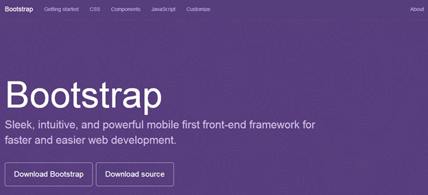
Whether you want to design a personal portfolio, a business website or a shopping cart, Twitter Bootstrap’s flexible and responsive capabilities will come in handy in all cases. It’s more than just a mere set of CSS and JavaScript rules, Twitter Bootstrap has within it an inbuilt responsive powerhouse. With many new features added to the third version of Twitter Bootstrap, it has once again proven that it is here in the web industry for the long run.
The JavaScript components of Twitter Bootstrap help you to design sliders that can run in any kind of device. Components like Modals, Dropdown, ScrollSpy, Tab, Tooltips, Popovers and Carousels are some of the best things you will like about Twitter Bootstrap.
You can start learning Twitter Bootstrap 3 today and make your web experience far more better in the year 2014. Try Twitter Bootstrap 3.

Foundation Framework

Foundation
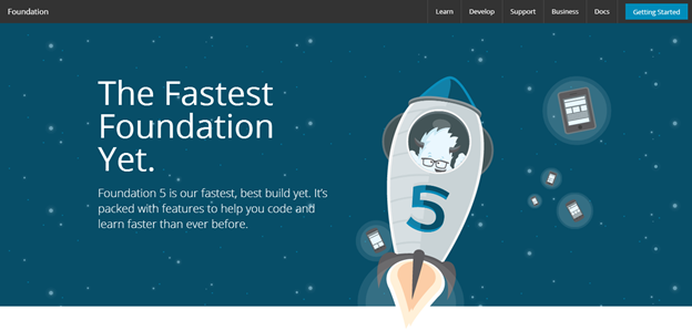
Foundation Framework by Zurb has emerged in the second half of 2013 as one of the best frameworks for web designing with its version 5.0. With features similar to that of Twitter Bootstrap—and some significant enhancements—it is expected to climb the ladder of popularity in 2014.
Foundation framework boasts a 12 grid system similar to Twitter Bootstrap. It also provides reusable HTML components and JavaScript plug-ins in its package. But unlike Twitter Bootstrap, Foundation has support for Sass stylesheets. You need to compile the Sass stylesheet, convert it into normal CSS files and then use them in your project. Adding Sass support makes it more customizable for designers who want to give that personal touch to the websites.
With features like Off Canvas and Improved form, it would be interesting to see web developers explore this framework to the most in 2014. Refer to Tahir Taous’s article to know what’s new in Foundation 5Try Foundation 5.

Gumby Framework

Gumby
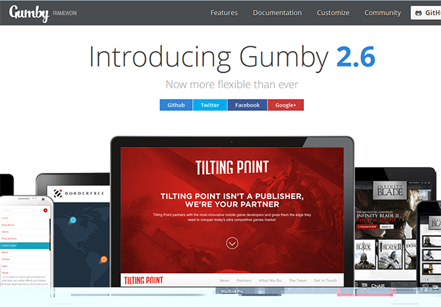
Gumby Framework is built on a Sass preprocessor that allows you to customize and build designs on top of the Gumby Framework. Designing with Gumby will require you to understand the basics of Sass. It can be customized by changing the variables values using Sass. Modular scale is another great inbuilt feature of Gumby that uses a Golden Ratio tool for typography.
Just like Twitter Bootstrap 3, Gumby framework provides support for Internet Explorer 8 and above and all the open source modern browsers.
Continuing with the industry standards, Gumby also has the 12 grid layout system. It logically divides the browser’s space into 12 grids and supports nested gridding. Some new concepts like Hybrid Grids, Tiles, Fancy Tiles and Semantic Tiles make this framework unique and definitely worth trying. Reusable CSS and JavaScript plugins are also provided by Gumby Framework. Try Gumby Framework.

Yahoo Pure CSS

Pure
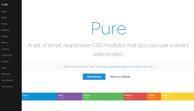
Yahoo Pure or Pure CSS is a lightweight CSS framework by Yahoo. It’s both extremely light and also responsive in nature. Unlike other frameworks, Yahoo Pure doesn’t have any JavaScript Plugins.
This framework also utilizes the popular 12-grid-layout system and has its own CSS rules to apply. For people who like the metro design of Windows, Yahoo Pure is the perfect CSS framework to start designing with. It promotes less shadow effects and almost no rounded corners in its designs. Yahoo’s skin builder can be used to customize the look when using Pure CSS.
Yahoo Pure CSS is perfect for developers who would like to stick to their respective framework but like to use the flat design. To achieve this, you have to just include the CSS file that is provided in the CDN by Yahoo. Try Pure CSS.

InK Interface Kit

Ink
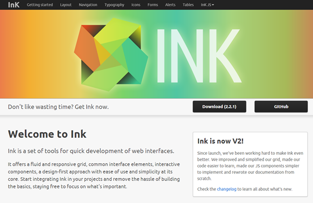
Being new to the industry and having learned from its seniors, InK provides solutions that most people could be looking for. It has both reusable HTML and JavaScript Plugins. The most unique feature in this framework is the ability to provide drag and drop support—which is still not present in Twitter Bootstrap 3, for example.
InK provides an amazing set of form validation classes which comes in very handy. Image processing is also another power feature. Using InK you can create multiple versiona of the same image and reduce the load time in various device types. It also has an impressive set of MIT licensed icons to play with.
With such an amazing set of power tools, InK is worth trying as a web designing framework, today. Try InK.
Other frameworks to try:
These are, at least, some of the best web designing frameworks that you can try in 2014. Why use frameworks at all? Well, who wants to start from scratch?
Note that the above list is not ranked in order of preference or excellence, it’s just list. Every framework listed has its own client, advantages and limitations.
I hope you enjoyed reading through the list. Now it’s your turn to let us know know which one of the above frameworks you think will have the greatest impact on web designers and developers in 2014. Leave your comments below, with supporting text.
We hope you have an amazing Christmas 2013, and a Happy New Year in 2014.

TETRIS & THE POWER OF CSS

To be really good at CSS, you have to learn CSS. I know this sounds like a tautology but I've become aware of a peculiar attitude that preprocessors such as SASS are somehow successors to CSS. Some SASS and LESS nerds are fond of proliferating the following aphorism. It should be noted that its author did not himself intend it as an advocation of preprocessors.
The four stages of CSS:

1. I don’t know CSS
2. I know enough CSS to get by
3. I _know_ CSS
4. Fuck CSS
They forget that all preprocessors do is make writing CSS easier, not qualitatively different: It's still CSS that comes out of the end. This is a shame, because vanilla CSS deserves some credit for being a powerful, rule-based language all its own and — when it comes to solving the kind of design problem I shall be exploring in this post — it doesn't matter how you "preprocess" the CSS; it's the naked CSS logic that does the heavy lifting.
Put down your classes, ladies and gentlemen, because we're talking about dynamic content and they cannot save you now.

Incomplete grids

Let's imagine we have a three-column grid but that we don't know how many items will be in that grid. Perhaps items expire over time or users are able to delete them from the list. To fit a three-per-line formation, each item must be floated left and have a width of 33.333%. Okay… so let's say we arrive at the page and there are 7 active items. Visually, it's going to look like this:
grid with an orphaned item at the bottom left
There's always one who just has to be different, isn't there? I call him "WHATWG"
Now, I'm the sort of designer who couldn't give a toss about "pixel perfection" so long as the page is usable and accessible. That said, this kind of blatant asymmetry is a bit jarring, even to me. What I need is a way to treat that last item — the orphan — differently. I'm sticking to the Tetris analogy, so I'd like to make that last item a full row (full width) and earn myself some points. (I know you can't change the width of blocks in Tetris; I'm just talking about making tidy rows, alright?)
We could do this by adding some logic to the template and writing a last class to whichever item comes last. However, we all know too much template logic is bad, especially when it breaks with the separation of concerns rule. That is, the last class would only denote visual — not structural — differentiation. Not only that but, if the user deletes an item, we'll have to dynamically rewrite the DOM to replace the last class on a new item with javascript. Poo to that!
The simplest and most efficient way to deal with this is to use the (very well supported) :last-child pseudo-class:
.grid li:last-child {
   float: none;
   width: auto;
}

We have a problem

So far, our technique is incomplete. Why? Because, so far we haven't incorporated any logic to determine whether our last item is, in fact, an orphan. This means that about 33.33% of the time we're going to make our grid prettier, but approximately 66.66% of the time we're actually going to make our grid uglier:
just using last child creates some ugly side effects
Grotty!
To fix this problem we need to leverage some of the CSS power you didn't learn while dicking about with SASS. Well, maybe you did, but in spite of SASS; not because of it. We're going to have to incorporate some maths, so let's consider the axioms:
  • The grid is three items wide
  • The grid contains any number of items
  • Orphans are last items
  • Orphans exist alone, on their own row
If you look at which item numbers correspond to potential orphans (items that would be orphans if they were the last items), the first thing you'll notice is that the list begins with "1": We don't want a single item, all on its own, to appear at 33.333% width. That would be weird. Counting up, 4, 7, 10, 13, 16 follow 1 as potential orphans. The interval, you will notice, is three. In other words, if you minus 1 from each value, you're looking at the three times table. Now we're getting somewhere.
Potential orphans highlighted
Potential orphans
This is where CSS's spectacularly useful :nth-child pseudo-class comes in. Since :nth-child can accept algorithmic arguments, we can predict and target potential orphans ad infinitum.
li:nth-child(3n + 1) {
   /* Selector not complete, so no rules yet. */
}
If, like me, you're not familiar with mathematical syntax, the 3n part just means 3 x n. The algorithm does this for values of n going up in integers (0, 1, 2, 3, etc. etc. etc.). So, 3n + 1 is first equivalent to 3 x 0 + 1, which equals 1. Then it's equivalent to 3 x 1 + 1, which is 4. That's the pattern we want, but our selector isn't finished quite yet.
(For a more detailed explanation of :nth-child, consult "Lord Of The Hootenanny", Chris Coyier's 2010 post).

Potential orphans and actual orphans

This is the part I love. This is the part where the modular logic of CSS comes into play. So far we've only identified potential orphans. That is, our selector only anticipates one of two conditions that must both be true for the targeted item to be a true orphan. The original condition that an orphan must be a :last-child is still true, so we must concatenate our two conditions in one selector chain like so:
li:nth-child(3n + 1):last-child {
   /* Now you are safe to do some orphan styling */
   float: none;
   width: auto;
}
the target element is identified
That's the chap
Note how the logic is similar to a more typically programmy programming language. It's a bit like saying:
foreach (items as item) {
 if (item.condition1() && item.condition2()) {
  item.adopt();
 }
}
Of course, making the orphan "full width" is just to satisfy my tenuous Tetris analogy. Instead, you could bring the orphan neatly into the center.
li:nth-child(3n + 1):last-child {
   float: none; 
   margin-left: auto;
   margin-right: auto;
}

Off by one

What if we also want to target last items that appear in the second column (or last items in 3-column grids which have a single gap at the bottom right position)? We simply copy/paste our selector and jog the algorithm on one integer to read 3n + 2. Now we can use the two selectors in tandem to ensure no gaps appear in our grid under any circumstances. No template logic or javascript DOM manipulation required.
li:nth-child(3n + 1):last-child {
   float: none;
   width: auto;
}

li:nth-child(3n + 2):last-child {
 width: 66.666%;
}
the final result: none of the 3 potential configurations leave gaps in the grid
Did you think I was actually going to recreate Tetris in CSS? Sorry, no. Nobody needs to do that.

Update

This update is dedicated to Aditya Raisinghani who left a comment with the great idea of incorporating nth-last-child(2) to make the last two items each 50% width.
How are we going to do this? The logic states, "if the second last item falls in the first column, make it and the one after it50% width to fill the row".
In the following snippet, I am going to combine Aditya's selector with an adjacent sibling combinator to fulfill the "one after it" part. We could, of course, use 3n + 2 again, but I prefer the way this reads.
li:nth-child(3n + 1):nth-last-child(2), 
li:nth-child(3n + 1):nth-last-child(2) + li {
   width: 50%;
}
the last and second last items at 50%